Showing posts with label Art. Show all posts

Friday, 18 April 2014

Tate Modern - Henri Matisse: The Cut-Outs


Henri Matisse: The Cut-Outs
Tate Modern (17th April 2014 – 7th September 2014)

Cut-outs can easily be considered a less-complex manner to create art. Indeed, creating collage by cutting and arranging images or patterns is something often attributed to childhood. But, like all art forms, developing a skill requires patience, experimentation and a passion that borders on obsession. Though cut-and-paste projects at primary school can be an afternoon’s pleasure or an integral part of a group puzzle, Henri Matisse devoted himself to cut-outs when restricted to a wheelchair in 1941. Gouache-painted sheets of paper, subtlety coloured in specific tones, accentuating the diverse range of colours were Matisse’s medium of choice in his final years.

The Tate Modern has showcased, and organised, an exhibition that charts Matisse’s final years. His initial experiments with collage (arranging and re-arranging simplistic bowls and fruit for a painted final piece) through to his obsession with patterns, colour and natural forms. Akin to a majestic performance, the exhibition saves his greatest act till last as, following his blue nudes, are his enormous cut-outs and window-designs that dominate walls, filling the final rooms.

Exiting through gift shop, the blue nudes are clearly the saleable and popular art pieces on show. The various experiments consisting of an elongated leg held by a crouching woman, composed of merely cobalt blue figures on a white surface is simply perfect. In this exhibition, we see the evolution of a version consisting of multiple papers, tweaked and layered to create the nude, and then the same nude composed of only one, perfectly cut, single sheet. The smooth, sharp slice of metallic scissors to cut out the arch of her back and the length of her thigh is surely as satisfying as hearing the long, smooth sound of a saxophone. Indeed, the playful, improvised and vibrant arrangements became a book, titled ‘Jazz’. He illustrated, supported by notes, and though unrelated to the music style, it remained an appropriate title.


Due to his sickness, his work becomes more abstract and spiritually dominant as you work your way through. Though the shapes are clearly integral to the images, he becomes more obsessed with colour in his later pieces opposed to the figures, shells and leaves seen originally. There is poetry to his contrast between curved and expressive shapes against the sharper edges of squared frames and defined edges. The larger the scale, the patterns become clearer and symmetry becomes an important way to balance the composition - but colour is larger and over-powering. With this in mind, it seems natural and purposeful that his work became more spiritual. The final room, demonstrate how natural his cut-outs are when converted into stained-glass. Christmas Lights (1952) showcases a true combination of considered tones and arresting shapes. Your eye looks up to the glorious light, demanding your attention in the centre of an abstract arrangement of form and colour. There is no Christ in a manger, or God touching the hand of Adam. It is proof that simplicity, such as the innocence in a child’s art piece, hides the greatest beauty.

Saturday, 14 September 2013

Tate Britain: Lowry and the Painting of Modern Life

Lowry and the Painting of Modern Life
Tate Britain (26th June 2013 - 20th October 2013)

We know Lowry. The small people, busy on the canvas. The factories and tall funnel-chimneys filling the air with smoke on the white sky surrounds the ant-like people. The industrial age is his primary inspiration, but only in this recent exhibition at the Tate Britain, do we see the true starting point and witness how he progressed – in a manner that never truly deviated from his original working-class depictions from the 1920’s through to the 1960’s.

Set within six rooms, Lowry and the Painting of Modern Life begins as we see who influenced his fascination with the working-class. Taught at the Manchester School of Art, TJ Clarke and Anne M Wagner curate the exhibition by connecting him to the Impressionists and the ‘modern life’ paintings of Manet. Seeing the initial images with Impressionist thoughts floating in your mind you realise that, akin to the busy brush strokes of Monet and van Gogh, Lowry doesn’t use busy brush strokes unless depicting a busy group of people. His brush strokes, in many instances, are the people themselves, busying the canvas. Expressive and catching the movement of the factory entrance or football stadium, the movement Impressionists sought to portray is caught by Lowry in the people who move; something often missed when it is contrasted with the firm, static buildings dominating the majority of the image. Unlike the Impressionists, Lowry shows this contrast rather than turn the entire image into a wash of vivid colours and marks.

That’s not to say the influence is any less clear in the remaining rooms of the exhibition. The second room arranges French realist images – including a van Gogh – alongside Lowry’s to show the comparative use of colour and composition.

The remaining rooms are arranged chronologically, noting his particular connection to destroyed landscapes. Landscapes destroyed by war or industrialism and the communities they left behind. We see The Cripples and The Removal (a title that should be ‘The Eviction’) highlighting the working-class communities themselves and the issues that remained following World War II. Many social-issues were improving – the National Health Service was introduced – but Lowry remains fixated on working-class poverty. The Fever Van that collects children – with parents well-aware that once child step inside, it is most likely they will not return.


The final room displays Industrial landscapes that Lowry adapted as he painted. “Lowry understood that British Industry was grinding to halt” writes Clarke and Wagner, remaining “sceptical about the ‘end of the old working class’”. Owen Jones, in Chavs: The Demonization of the Working Class, repeats the New Labour idea that “we’re all middle-class now” – and how the working class have been destroyed following Thatcher’s dismantling of the unions and closure of the mines. Jones refers to ideals and political attitudes at the end of the millennium and into the 2000’s – Lowry paints these final images in the 1960’s. Maybe the era is different; maybe rickets and TB is long-gone – but poverty still exists in the UK – considerably more in the Northern communities Lowry painted. Hauntingly poignant, Lowry’s paintings become ghost-like images of a time that is no more – one can only imagine what a modern-day Lowry would paint – call centres? Westfield? Even the High Street is no more.

Thursday, 12 September 2013

Tate Modern - Ibrahim El-Salahi: A Visionary Modernist

Ibrahim El-Salahi: A Visionary Modernist
Tate Modern (3rd July 2013 - 22nd September 2013)

African Art, to many, is considered limited to artefacts and cultural motifs such as masks and jewellery. Though this has its own appeal showing the long history of a fascinating civilisation, African modernists, such as Ibrahim El-Salahi, show a side to Africa that is very much up to date – and challenging ideas and attitudes in the West.

Born in 1930, El-Salahi has been involved in the Arts since the 1940’s employing techniques and methods as diverse as calligraphy, painting, drawing and writing. The retrospective at Tate Modern shows how varied his work is – and yet, how incredible adept he is when altering his skills to suit a different outcome. Though ‘A Visionary Modernist’ primarily focuses on his more abstract work, within Room 2, you gain a chance to see the paintings produced during his government scholarship at the Slade School of Fine Art. These portraits are observational and textured and could easily be amongst the portraits currently on display at The National Portrait Gallery’s BP Portrait Award. Considering El-Salahi turned away from representational study, the foundations of such traditional ideas surely enhances the later works that he is celebrated for.

His breakdown of calligraphic lettering, and his rearrangement within paintings, became core to the image of the Khartoum School and this retrospective shows the building blocks that led to El-Salahi’s language. Reborn Sounds of Childhood Dreams I from 1961-65, is akin to a city-scape whereby the colours resemble bones and skeletons rising up from the ground; mighty like skyscrapers; organic in their shapes.

His later works become more conceptual as he produces multiple, smaller pieces, named The Tree. They all grow in an organic fashion as he built up the lines steadily, like the growth of plant. Many pieces remain connected through straight, defined lines – anything but natural - and remain clearly organised and structured. The ideas are conflicted – as you look at a conceptual, flat, straight-lined image named The Tree.
Such a diverse range of techniques show a deep respect for Art History – but also for his own cultural roots. A video interviewing El-Salahi describes who he produces art for – himself and his “ego”; his own culture and, finally, everyone else. His art aims to reach all and as someone far removed from the Sudanese and Islamic background El-Salahi is from, it is a testament to his skill that I am so inspired by his work.

His Art can effortlessly imitate cross-hatching techniques of Renaissance figure-drawing, distort bodies and stretch them out like Giacometti (Funeral and the Crescent, 1963) and then show a clear connection with African masks (Self-Portrait of Suffering, 1961) – and yet something remains the same; his love, passion and appreciation of what Art is. There is no arrogance or ignorance; no pretence and assumed intelligence; just a desire for understanding. This is what speaks loud and clear, and what draws you in – a man on a quest to create beauty and in ‘A Visionary Modernist’, Ibrahim El-Salahi has achieved that.

Tuesday, 17 July 2012

Tate Modern - Damien Hirst: Retrospective

Damien Hirst is a bit of an enigma. On the one hand, he is one of the most famous contemporary artists in the world. On the other hand, he is the first artist people choose to mock when discussing the absurdity of contemporary art. "How can a shark, in a tank, be Art?" they say. Damien Hirst and Tracy Emin are the two popular artists who are automatically deemed 'not good enough' for an Art gallery. Ironically, both have had exhibitions in London recently (Emin's at The Hayward Gallery) that show a full retrospective of their careers to critical acclaim. And in both cases, I loved the exhibitions. It seems that their popularity is not without reason.

I firmly believe that Art is much more than an attractive landscape or a modern, abstract painting. Art is about experience and how, for a moment, you can feel out-of-this-world. Art can be about changing your attitude to something or making a subtle, but important, point. The question is never "What Is Art?", the question is whether it is worth your time and attention.

So it came as no suprise that Hirst is now exhibiting the first 'substantial survey' of his work so far at the Tate Modern. His 'Untitled' dot-paintings from the late eighties through to the unforgettable 'shark' (aka The Physical Impossibility of Death in the Mind of Someone Living) and his latest butterfly paintings from circa 2007. His work tackles death and the temporary nature of life. Cigarette's stubbed out represent a 'mini life-cycle' according to the guide - and upon seeing cigarette-stub pieces in Crematorium and The Acquired Inability to Escape, one wonders whether these temporal fags mean much at all. Nevertheless, the clear theme is established and you begin to realise that temporal life, seems to be what every other art piece is about.

The use of dead animals is common in Hirst's work and, upon visiting the gallery, I really felt drawn to the art that highlights our own attitude to death. A butterfly. A cow. A fly. A shark. They are (just) animals, like us. One has no more value than the other, does it? Maybe the splitting of a cow in Mother and Child shows the completely fascinating intricacies within a cow. Kandinsky compared the colour of green to a "cow chewing the cud". He felt green was a dull colour and represented little. Are cows that dull? Maybe they are when "chewing the cud", but perhaps the decapitated head of A Thousand Years changes this. It is almost horrific seeing this bloody head  on the floor as flies slowly hover around the head - before their own timely fate in the Insect-O-Cutor above. So if we see shock and horror in the cows head - do we see the same about the insects dropping dead to the ground when hitting the blue-light? No? Why? A cow. A fly. Just animals.

The butterflies are not all dead. And, I am told, they are cared for and lead a very full life. As far as butterflies go. To have an exhibition piece, In and Out of Love, whereby butterflies hover around a room amongst paintings which are blank, surely highlights how death is not all doom and gloom. And some animals, really are, a thing of pure beauty. The butterfly images became more religious as they are displayed (deceased now and stuck-fast to a shaped canvas) to recreate what appears to be a stained-glass window in Doorways to the Kingdom of Heaven. Beauty, faith and animal-life. Death is not confined to the formaldehyde solution in tanks.

Ironically, when you emerge from In and Out of Love, the attendants check that the butterflies have not joined you as you leave. I assume, if they find one, they put in back in the correct room. Then, as you stand, head a little busy from all the butterflies, you see The Pharmacy; a complete re-creation of a pharmacy. It is static and nothing moves. Lots of colour, but nothing natural. Indeed, everything is created - created to extend life? created to assist in life? It looks unnatural, especially as we know that in the room next door, butterflies hover around in wondrous beauty. The only 'life' in this room is you and the other gallery visitors. Now that is dull. 

I really do believe Damien Hirst is an important artist and he does require your attention. This exhibition seems to cover his work and truly shows how - and why - he is an important British artist. A great exhibition that I hope Londoners - and Olympic visitors - will manage to see in the coming months.

Tate Modern presents the first major Damien Hirst exhibition in the UK
The Damien Hirst Exhibition is running from until 9th September 2012 at the Tate Modern.
Large Association of Movie Blogs

Tuesday, 5 June 2012

Art Against Knives: THE PRINT SHOP

This was originally published on TQS Magazine on Saturday 2nd June 2012. Every now and then I have written about Art Exhibitions at The Saatchi Gallery and The Hayward Gallery. Hopefully, thorugh writing for TQS I will write much more about Exhibitions in London!

August 2008. Art Student Oliver Hemsley, 20, was in Shoreditch, London, walking with a flatmate. A group of youths, one the age of only 15 years, attacked him. A random street-attack left Oli paralysed as one stab-wound to the neck led to a spinal cord infection, spreading to his brain. Prior to the attack, he had been accepted at Central St Martins College. He was tipped to become a "star fashion designer".

In response to this, Art Against Knives was born. Originally an auction which aimed to raise money and inform others about the situation. Students from CSM were the first artists involved but then it grew - donations from artists including Tracy Emin, Anthony Gormley and Banksy all ensured the exhibition became a national success with coverage in leading publications including The Independent, Vogue and the Evening Standard.

The current exhibition and auction, The Print Shop, is a much smaller affair based within the Boxpark in Shoreditch. These are prints designed by professional graphic-designers at BD Network and produced by young people in East London. Unlike the previous auction, this auction is a testament to the projects AAK has implemented across East London, whereby a weekly workshop in collaboration with Hoxton Hall is available to young people in Dalston. The work on display has been printed by these young people and funds raised will go directly back into these projects to continue to support the thriving arts in the area. The charity tackles the 'root causes' of violent gang culture by offering an alternative in the form of expression through the arts - and the 'Mystical Creatures' and 'Strange Beings' which are on display in the exhibition show a playful attitude towards expression and what is defined as art.

In fact, many of the designs seem to imitate artistic-styles seen across the world in the form of Street Art. Only recently, Shoreditch and Old Street were inundated with Street Art designed by artists ROA, Phlegm and Stik - amongst many others. As an example, ROA enlarges animals which are harmless - squirrels, rabbits, etc - and, through the expressive and rough style of drawing and the large-scale, the animals become threatening and scary. At 'The Print Shop', the animals chosen - wolves, apes and bears - are dangerous but they are turned into decorative art, postcards and canvas bags. As a reflection of what the charity supports, the angry-animals of Dalston, have already turned to art as a way of expression. Other prints have a more cartoon-sensibility, but they still look similar to the street-art that has emerged recently in East London. As an Art teacher, I love how these designs are so professional and will clearly engage teenagers in the area - it is playful, fun and a great example of what Art can be. It does not have to be within a white-space with an elderly patron handing leaflets to you as you walk in - these are art pieces made by young-people, for young-people and so it is relevant to the teenagers in the area. A refined, professional and finished version of the doodles and cartoons completed in the back of an exercise book or a homework-planner. They can relate to it and will realise that art can be those doodles and cartoons.

The exhibition will continue to run between 1st and 14th of June, at Boxpark Unit 55, in Shoreditch. Gallery opening hours are 11am-7pm, with a later-opening until 9pm on Thursday and a shorter-opening on Sunday, by shutting at 5pm. Well worth popping down and supporting a worthy cause.

Visit the site for more information!

Tuesday, 10 April 2012

Fantasia (Various Directors, 1940)

"Now, look - will the soundtrack kindly produce a sound?"

Introduction

As mentioned during the week, this film was bought for me as a birthday present. For a long time I was keen to watch - or rewatch - the Disney 'Classics' Canon. Fantasia is a funny film as many people dislike the film - vividly remembering The Sorcerer's Apprentice with Mickey Mouse but not-so-keen on sequences like the 'soundtrack' whereby the composer converses with a vertical line that shimmers and changes shape according to the instrument played. You win some, you lose some I guess.

The Filmmaker as an Artist

Having recently taught lessons on the artist Wassily Kandinsky, I was amazed to see various theories that he believed discussed in the film Fantasia. To clarify, Kandinsky was "fascinated by music's emotional power" - music had no constraits or literal form, whilst at the time, to some extent, Art did. Kandinsky experimented with the idea that Art could be as expressive, abstract and emotionally involving as music creating art pieces that contained a musical playfulness and resonance. The very first thing Fantasia 'teaches' us, is the connection music has with art. Deems Taylor, who 'narrates' each segment states:

"What you're going to see on the screen are the designs and pictures and stories that music inspired in the minds and imaginations of a group of artists."

He even goes further to explain 'three different types of segments'

"First, there's the kind that tells a definite story. Then there's the kind that while it has no specific plot, it does paint a series of more or less definite pictures. And then there's a third kind, music that exists simply for its own sake ... what we call "absolute music". Even the title has no meaning beyond a description of the form of the music. What you will see on the screen is a picture of the various abstract images that might pass through your mind if you sat in a concert hall listening to this music" 

For a family film starring Mickey Mouse, this is hugely informative and filled with art theories associated with 'high art' at the time. Kandinsky died in 1944 at the age of 78, so it is safe to assume that his theories and artistic practice was clearly known in the art world by 1940. It'd be nice to think that maybe, just maybe, Kandisnky watched Fantasia. If he did, I'd be very interested to know his opinion. In an attempt to see if there was any quote from Kandinsky on the film I found a short blog post that managed to see the connection I have seen between Kandinsky and Fantasia too.

Access to Classical Music

The conductor Leopold Stokowski introduces many segments and, to add to the feeling of watching an orchestra, we see the orchestra set-up and prepare at the start. An interval additionally shows the orchestra 'leave the stage' before re-emerging (and even engaging in a little playful improvisation) before the second-half commences. I believe that Disney wanted to bring the beauty of classical music to the masses. I know here in England, it is not neccessarily easy to find a full orchestra play classics if you don't live in London. So in the big, expansive US of A I assume it will be even more difficult. If you live in small little town in Utah, to 'experience' the Philadelphia Orchstra playing Tchaikovsky is unlikely - so every effort has been made to make you 'feel' like you are watching a live show. The hustle and the bustle of the set-up, the opening curtains, the 'improv' playing and lack of camera-movement as the Orchestra are seen. We don't move through the orchestra or see out into the audience - everything is from the front, sometimes in close-up to focus our attention to a detail, but ultimately from the front. Reminds me about Dial M for Murder, whereby Hitchcock attempted to use 3D to make it appear that you are looking up to the action 'on the stage'.

Off-Balance

Despite the good intentions of the filmmakers, it is clear that some sequences work and some do not. Obviously, The Sorcerers Apprentice is iconic and unforgettable. The fact that the purpose of the sequence was to re-establish Mickey Mouse after he became a little less popular at the time, clearly worked a treat. The animator Fred Moore even added white's in his eyes to give him more opportunities to express himself - the 'character' being the centre-point to much of Disney's success. But the 'soundtrack' sequence as a literal soundtrack  - a vertical line - changes shape and colour to demonstrate the different instruments, feels a little out of place. But again, as weak as this one sequence may appear, I think it is 'teaching' us the different sounds - what exactly does a clarinet sound like? The sequence literally goes through different instruments and shows us the sounds they make.

Another sequence is based on 'Science'. I felt that this was quite groundbreaking in how it depicts the beginning of the earth through to the extinction of dinosaurs. I vaguely remember this sequence as, pre-Jurassic Park, I was a huge dinosaur fan and this was one of the view visual associations I could have. I think the ground-breaking element resided in the presentation of evolution 'for kids'. I know that, even now, many children simply do not 'believe' in evolution, but it is clear that Disney is trying to ram this reality home: "And that story, as you're going to see it, isn't the product of anybody's imagination. It's a coldly accurate reproduction of what science thinks went on during the first few billion years of this planet's existence. Science, not art, wrote the scenario of this picture."

Innovation and the Future

This was the third Disney film - following Snow White and the Seven Dwarves and Pinocchio. One thing that is exceptionally clear from watching the special features of these earlier films, is how much innovation Disney brought to animation. The first feature-length animation in Snow White, fascinating angles and uses of colours to show dream sequences - Disney's work with Dali on Destino. It truly is awe-inspiring to see such amazing talent on screen. Fantasia for all its inconsistencies, again presents us with a broad range of incredble animation - from the abstract shapes, colours and ideas that open the film, through to the fun and engaging The Sorcerer's Apprentice and Nutcracker Suite. The science lesson in The Rite of Spring and the 'introduction-to-ballet' we have with the Dance of the Hours and to finish with the incredibly scary and sinister devil in the Night on Bald Mountain and Ave Maria. Whether it works or not (21st Highest Grossing Film of All-Time when adjusted for inflation through the multiple re-releases it has had since its release in 1940... I think this means it worked...) is not so much the point as it is an fascinating idea and stunning to observe - either showing one sequence or watching the whole 'experience'. Another ground-breaking release from Mr Disney.

Large Association of Movie Blogs

Sunday, 20 November 2011

The Wallace Collection

I initially planned on visiting Speaker's Corner today near Marble Arch and, when I arrived only one speak was there. Due to this, I had a little bit of a wander and stumbled across The Wallace Collection. I have never visited this gallery and, upon walking into the front door, it was clear that the art housed within the building was 18th Century, with Art dating further back...

To think such a stunning gallery existed and I never knew! I am going to write a couple of notes on three pictures which I specifically enjoyed and are housed in this stunning building.

Fragonard's The Swing (1767) - A tour discussed this picture and the information was simply fascinating. The painting is deemed a boudoir painting. It depicts a woman on a swing, the light emerging from ... the centre. Notice the vicar pulling the swing and the man on the bottom left looking directly up the girls dress. Even cupid puts his finger to his lips - we are see something saucy! It also firmly depicts an example of painting during the Rococo period as the painting has a strong use of nature and is completely unsymmetrical in the composition. I love the painting, and the fact that it is 'dirty' makes it that much more appealing.

Titian's Perseus and Andromeda (1554-1556) - This painting, for a long time, was not attributed to Titian and hung in the bathroom of the Wallace household. The taps resided beneath the very centre of the painting so you can imagine the damage the steam from the use of those taps had on the painting. Tragically, when it was accurately attributed to Titian, the damage was already too much and it has not been adjusted. Due to this you can see how the painting was not executed as successfully - the left-arm of the falling Perseus you can clearly see has changed its place and there are many other alterations which were made during the execution of the painting. Not Titian's finest, granted, but definaetly an interesting back-story with a nice example of Titian's accuracy in depicting flesh.

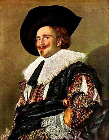
Frans Hals' The Laughing Cavalier (1624) - Unfortunately, not much information given on this painting. A brilliant portrait, it clearly provides a great contrast between pattern and texture as the 'Cavalier' wears expensive, decorative robes. His slight-smile even recalls the smile of the Mona Lisa.

For posts on Modern Art, I have written posts on exhibitions at The Saatchi gallery (The Shape of Things To Come and British Art Now) and on Christian Marclay's The Clock

Large Association of Movie Blogs

Friday, 29 July 2011

The Shape of Things To Come: New Sculpture (The Saatchi Gallery 27th May - 16th October 2011)

Introduction

I need to write about more Art galleries. I need to write about more Art galleries. As sporadic as it is (a post on Christian Marclay's 'The Clock', the Newspeak Exhibition). But, once again, an exhibition at The Saatchi Gallery in London has completely inspired me to write. I reiterate my point that the foundations of film and cinema is in Art - and through understanding the history of Art and keeping in the loop with contemporary Art you will enjoy film-watching moreso.

This exhibition focussed on sculpture and, in discussion with friend Jenkins, he stated how what is so successful about exhibitions at The Saatchi Gallery is the layout. The gallery is not afraid to put a single art piece into a room despite having quite small spaces to fit art pieces in. Even the layout is a little random - forcing you to walk up and down stairs, up and around in lifts if you are keen to visit each gallery before popping to the basement to see a room full of oil. It is still an incredible gallery with pieces that inspire and resonate.

Crashed Cars and Obscene Acts

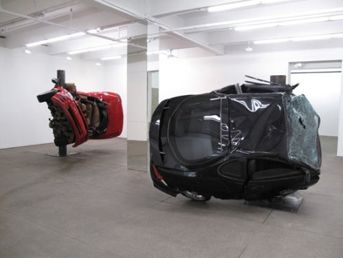
My favourite artists work funnily enough coincide with my recent interest inn David Cronenberg. I spent a large portion of time wandering around and through the work by Dirk Skreber. His two pieces (strangely titled "Untitled (Crash)" - why not just "Crash") used a single metal pillar and physically wrapped (what appeared to be) fully functioning cars around the pillar. The cars stood tall, in the air almost, and appeared to show a specific moment in what would usually be a fast, chaotic state. On the one hand, I think about Michael Bay - and how parents should take their children to see this exhibition whereby they would literally stand in awe at these huge metal creatures rather than sit and be [metaphorically] punched in the face multiple times, wearing 3D glasses in a darkened room. An incredible experience to see his art work.


David Altmejd is another favourite who used figurative form and corrupted it. I recall two pieces - one whereby a single figure stood tall and winding around it and through it were multiple stairwells and mirrored surfaces, reflecting the different contortions and creations. It was as if M.C. Escher had been turned 3D and then stretched across the figure. Altmejd's larger scale piece, The Healers, was fascinating. It consisted of many, many figures all in sexual unison in a variety of forms - but the faces were often distorted and the figures were all joined up. They were often asexual and, in almost all cases, had further sculptured hands twisting and breaking free from the figures. It was obsecne, explicit and facsinating - you wanted to peer in to see more detail as if to ask how the whole sculpture was possible. On one leg, the knee was a combination of two hands connected, another showed a face completely removed as the penis of another figure protruded through. His work reminds me of Cronenberg's filmmaking whereby the physical form moulds and mixes with other shapes. Berlinde De Bruyckere equally showed a Cronenberg-esque style whereby horses almost looked like they had been melted down into an almost blob-like form. Both artists forced you to look close and carefully at what exactly you were looking at.

Finally, an artist who I truly enjoyed was the cubist inspired Thomas Houseago. His art pieces showed figures that combined oppostie approaches - figurative but abstract, complete but appears incomplete, etc. As a teacher, I speak to pupils about Picasso regularly - he is an artist who can fit so many forms and ideas. You can get any idea or object and, with Picasso's influence, distort and change it into a range of different ways. These pieces, as soon as you walked in, showed these multiple-angled but flat-surfaced 'creations'.  Great to see.

The Viewer chooses the Meaning

Now, a couple of artists failed to inspire me. Peter Buggenhout's potential-pieces-of-rubbish apparently challenge the viewer into considering what should and shouldn't be Art. The pieces, we are told, have been created - thye are not random or purposeless - but the artist has "carefully made" each one. Problem is, it is not clear what the purpose is. He questions the "strong influence of projection on the way art is perceived". Well, sorry Pete, I perceive very little and that gives me a question - do you truly believe your art is any good? Because I don't.

Oscar Tuazon's Bed equally seemed to be problematic too - originally his own bed and then converted into an art piece, this seems to have a lack of focus. I appreciate that it must have been interesting when within a flat/house and the extreme process of building this strange bed-shape, but in an Art gallery it seems out of place and out of context. Sometimes, art pieces should stay in bed.

A Great Show

I absolutely loved the exhibition - and there are many more artists who I enjoyed: Anselm Reyle, John Baldessari and Folkert de Jong  all presented work that I could've spent much longer looking at. I think, as film fans, we owe it to the Art form to appreciate these exhibitions because - as we know from directors like Steve McQueen, Sam Taylor-Wood and Tracy Emin - incresingly, artists are turning into filmmakers and these shows give us an indication as to what their films may be like. I'd like to see more filmmakers from teh Art world - rather than coming from the producing/business side of the industry (no offence to Matthew Vaughan).
Large Association of Movie Blogs

Wednesday, 9 June 2010

Newspeak: British Art Now (Part 1, The Saatchi Gallery 30th May - 17th Oct)

Introduction

I have complete intentions to be more prolific with my writing here but currently I am in a truly rubbish position as the internet has yet to be connected at home - thus I complete posts after work which is a shame. But alas, one thing I want to start doing is going through exhibitions I have visited in London. I personally see that Art is the foundations for almost everything - may it be Film, Music or Drama. It is that sense of expression which creates tha wonderful art today. I could go on with how Scorsese completed incredibly well drawn and accurate sotryboards - or discuss how James Cameron is an accomplished artist (it was his drawing of 'Rose' Jack was drawing in 'Titanic'), but whether there is evidence outside of their cinematic back-catalogue or not, the films themselves show enough to prove their artistic merit. (Nb. All the Art I mention is in the pictures displayed but, be aware that some are not next to the point they are discussed...)

The Walk Around

Having walked around the gallery it truly is impressive - a wide variety of styles and approaches to Art. Accurate observations alongside obscure, abstract sculptures. The inluence of culture of many pieces of work is inevitable - whether it be an sculptures of almost-Greek origin or an update of previous styles, inevitably, everyone will find something interesting about this exhibition.

Lowlights
I followed The Saatchi School - a reality TV programme that followed a group of artists leading to one being chosen to appear in this exhibition and the tour it is a part of - which begun in St Petersburg. The Winner was Eugenie Scrase with her piece 'Trunkated Trunk'. I remember watching the show and, though not a big fan of the Duchamp object-is-art approach, I could appreciate the unique entity of the hevy weight of a log and what appears to be careful balance on a fence. More impressive was the gate holding, virtually, the entire tree before it was trunkated - but alas, it is what it is and, upon viewing it, it truly isn't as inspiring as I believed it could have been. I think, by seeing the 'trunk' in comparison to the range of other artists part of the exhibition showed how, in comparison it was not really that impressive. Make of it what you will.

Another 'weaker' piece was Scott King's 'Pink Cher'. Andy Warhol was fifty years ago - the Cher and Che connection is weak, at best, and - in my opinion - has been commented on enough. We understand the disease that is the celebrity culture - we have seen Marcus Harvey's Moors Murderer painted by childrens hands. It says very little that is new.

Finally, we have John Wynne - an artist who uses 300 speakers to create an environment that, though uneasy, I had previously felt before. The Brazilian artist Cildo Meireles' Tate Modern Exhibition included a piece titled Babel - a huge tower that was made up of small radios all individually tuned and, with their glistening LED lights and discomforting sound even reminded me a little of Blade Runner. John Wynne didn't seem to have many of the speakers on it seemed - walking around the space seemed to show that the majority of sound was from around the self-playing piano. If all the speakers were clearly working, I may have been more understanding - but alas, the range of speakers that didn't work merely highlighted a lack of atmosphere. Ultimately, Meireles' tops him anyday.
Highlights

Personal favourites were in the form of 'littlewhitehead', Hurvin Anderson and Iain Hetherington. Both Hurvin Anderson and Iain Hetherington are both, primarily, painters. Andersons almost abstract landscapes are fascinating. 'Untitled (Black Street)' is clouded in darkness gives the feeling of coming back from a school trip, whereby the school is closed and darkness surrounds the buildings. Its eerie and dark, whilst at the same time comfortable and engaging - the single road leading you into the darkness. A beautiful work of art. Iain Hetherington, on the other hand, seems to merge objects into canvases of mixed colours. The NYC caps I have seen are often worn by the cliche 'youths' who torment communities - so, to see the same cap tunred into a work of art through an abstract setting changes your opinion.

Finally, 'littlewhitehead' (Should I call you 'head'?), in the style of Joseph Beuys, uses mannquins and places them in a position that forces you to personally get involved. The one piece I saw at this exhibition was 'It Happened in the Corner', whereby the figures are all huddled in a corner - their clothes appearing tatty and rough - and you are forced to look into the corner with them. The entire look of it and unsettling nature makes you question your reaction to this type of situation - our facination with potential-horror and the mob-dynamic and sheep mentality as every follows each other. Every person in that room walked to the corner and joined the group - peering at the ground...

Finally, the link to the actual website to explore more - and their truly is alot to explore.
Large Association of Movie Blogs